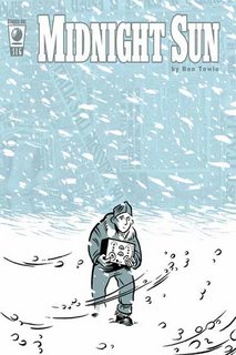
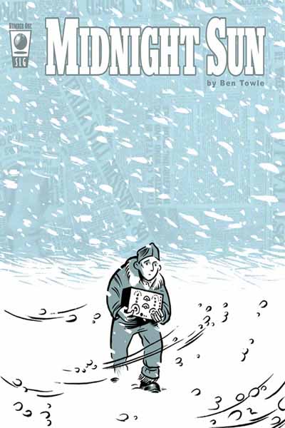
Sunday, July 30, 2006

Ebay Auctions Are Up

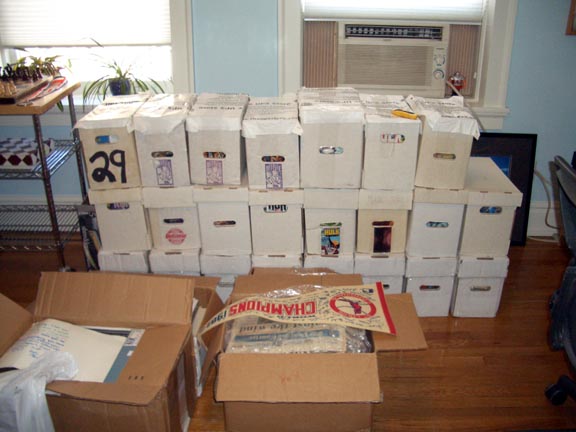
I just listed my first batch of Ebay auctions. You can check them out here. This is just the tip of the iceberg as I've got literally boxes of comics to sell, both mainstream and alternative, so please check them out and check back here periodically for new links.

BTW, I used Ebay's Turbolister tool to create these auctions. It was my first time using this tool and I found it pretty helpful once I got the hang of it. If you're interested, you can download it here. It's free, and pretty easy to use.

Tuesday, July 25, 2006

Baggage Check: Grimjack, Escapists and Crazy Papers

It’s amazing the comics I own which I didn’t even know I had.

For example, apparently somewhere along the way I picked up a run of the first twenty issues of First Comics’ Grimjack. You would think I would remember that, but I didn’t. Nor did I ever read them. So this weekend I read the first four issues, and you know, they were actually pretty good for ‘80s mainstream comics. Writer John Ostrander really captured a strong voice for his lead character, who narrates his own adventures, and Timothy Truman’s artwork is reminiscent of Todd McFarlane’s with a touch of Wally Wood thrown in. His figures are occasionally spotty, in that they sometimes look out of proportion, but this is mostly in the background characters and not a deterrent to the stories themselves. Grimjack, aka John Gaunt, is the classic anti-hero. Part cowboy loner, part detective and part gun-for-hire, he operates in a city, known as Cynosure, where all realities meet - a shrewd concept which allows the creators to employ any and all comic book genre elements. I don’t know that I’d say, based on these first four issues at least, that Grimjack is any kind of classic of the artform, but if you’re looking for solid, above average mainstream work, these are a pretty good place to look. And who knows? Maybe the series gets even better later in the run. I may actually continue reading since, you know, I own them.

I also discovered my run of the first 18 issues of the Untold Tales of Spider-Man by Kurt Busiek and Pat Oliffe. Remember this one? This was basically the ‘90s version of Ultimate Spider-Man, retelling origins and classic stories with a modern twist. Actually, that's not fair. They weren't straight re-interpretations like Ultimate is, but rather stories that fit into the early continuity, and tried to explain some of the inconsistencies or just add to the originals in some way. I remember LOVING this series when it first came out, and thinking how Oliffe did a better McFarlane Spider-Man than McFarlane himself. I don't think I'll keep these, though.

It’s strange rediscovering all these super-hero comics of my past. I mean, I still appreciate good super-hero comics, though clearly not as often as I used to. But I was SO into this stuff back then. Like many, I just followed certain creators from one title to the next, and any time a certain creator or book got “hot” (which I probably discovered in either Wizard Magazine, Hero’s Illustrated or Comic Shop News, since there was no Internet back then), I was certain to get it. This celebrity mentality still exists today in comics, perhaps even moreso, so I’m not saying I’ve outgrown this at all, but it’s fascinating how my tastes have shifted over the years.

I have been reading some recent stuff as well. I loved the first issue of the new Escapists series from Dark Horse. If you haven’t checked this out, I highly recommend it, especially since the first issue is only $1.00. Brian K. Vaughan may be the best writer working in mainstream corporate comics today. Just a couple weeks ago, I caught up on almost a full year of Ex Machina (though I’m still way behind on Y: The Last Man) and I have to say that is a damn fine book as well. The “Fact or Fiction” storyline about Mayor Hundred’s jury duty experience was particularly outstanding, though really they’re all very good.

Anyway, the Escapists is a six-issue limited series with a rotating cast of artists. The first issue is superbly illustrated by Phillip Bond (with an awesome 3 page scene illustrated by Eduardo Baretto and colored by Paul Hornschemeir), and reprints the story which first appeared in the Eisner-winning anthology, Amazing Adventures of the Escapist #8. The story centers around Max Roth, a young man whose father was obsessed with the Escapist, the fictional comic superhero first introduced in Michael Chabon’s Pulitzer-prize winner, The Amazing Adventures of Kavalier and Clay (no knowledge of the novel is required). Deciding to pursue his father’s dream, the young man purchases the rights to the character and prepares to resurrect the comic for a modern audience. What makes this such a strong first issue is the honesty in Vaughan’s writing. Creating a protagonist who is a comics writer makes it easy for Vaughan to pour much of his personal experience into the character, and the result is a very authentic, well-developed lead. I am very excited to see this story unfold, and what the other artists bring to it. The book closes with an interesting speculative essay placing the fictional Escapist comics into a semi-factual history of other Golden Age comics.

I also read Crazy Papers by Jim Dougan and Danielle Corsetto. The book is published by Chatterbox Comix and it’s a pretty nice-looking, 50-page one-shot romantic comedy about a group of three young women in Washington D.C. When they go out on the town for a crazy night, Amanda ends up falling in love with a guy she knows very little about. Her other two friends are dragged into the whirlwind affair and the whole story devolves into a sitcom-style comedy of errors. On the back cover, Dean Haspiel describes the book as “a lost episode of Sex in the City” which is a pretty accurate description though I would take it one step further and say it feels more like a Sex in the City episode as if written and illustrated by Brian Michael Bendis. The tone and style of the book really reminded me of Fortune and Glory. Corsetto's style is almost that of one of those street caricaturists you see in Times Square or Central Park, where many of the characters features are exaggerated for comedic effect, and it works well here, enhanced greatly by some well placed background imagery, including some limited Photoshop effects, and gray-scaling, which gives the art depth and texture. Overall, it’s a solid entertaining little book, with enough wit and charm to make it worth seeking out.

I’ve read tons of other books lately, but it seems like my time and motivation to write reviews has been pretty limited recently. I definitely plan to review Alison Bechdel’s Fun Home at some point. Not only is it THE graphic novel of the year, but I also had a surprisingly strong emotional reaction to the book, given my own dysfunctional family history. I think that’s part of why I haven’t gotten around to reviewing it yet. I also read Daniel Clowes newest collection, Pussey! which was interesting and kind of funny in its parody of the comics industry, but not really his strongest work and more than a little dated. Some of the satire about the industry is still relevant, but for the most part, it’s more of a curious period piece from early in the artist’s career.

Thursday, July 20, 2006

The Secret Origin of Unattended Baggage


You know, when I named this blog Unattended Baggage, I had no idea how much of it I had. I mean, I sort of knew, but not really.

This past weekend I shipped my entire comic collection to the East Coast from St. Louis. 30 boxes!!! Seeing it all at once, in one place, is daunting and exciting all at once. Daunting in its sheer volume. But it's fun, too. I mean, who among us doesn't love digging through long boxes now and then?

But this stuff is, quite literally, unattended baggage. This was my childhood. The refuge I took from my parents. The hours spent in isolation. It may seem like a cliche, but the physical evidence stands before me. I really did escape completely into comics.

And you know what? I'm still there. Deeper than ever.

So now I'm faced with the monumental task of purging. There's just not room, and honestly, what do I need all this stuff for? I'm never going to read most of it again. And though I had once dreamed it would be worth something, the truth is most of it's mainstream superhero crap. Of course, I loved it at the time, but my tastes have changed so much.

So here's my plan. EBay what I can. Donate the rest. I'm going to go through every box, and I have no doubt that I'm going to blog about it quite a bit. If you saw this post, you get the idea. Incidentally, I found all four of those comics.

I'm still going to do Shelf Life, my Love & Rockets project and the occasional review, but this has to be done.


So tonight I went through my first 2 boxes. The first was a bunch of really old DC stuff, early Silver Age. A haphazard smattering of old Justice League of America issues, including some early 12 cent ones. I pulled out my top 10 that I figured either were worth something or I actually might read again sometime (see folks, denial ain't just a river in Egypt!), or both. The rest I'll get rid of.

There was also a similarly scattered run of Marvel Team-Ups, including some of the classic issues. I had to keep the issue where Spider-man and Jim Belushi team up. And of course, the Byrne issues, which I'm told are beautiful. It's fun to go through random issues and see what great artist did which issues. For example did you know that Chris Claremont and Howard Chaykin did #76 (Spider-Man and Dr. Strange)?

Finally, I found a bunch of very early issues (in the 100s) of World's Finest. There were even some 10 cent issues. Scanning each of the covers, I never realized how many times the comics back then either a) shrunk superheros to microscopic sizes, or expanded them into giants, or b) pitted them against either each other or an evil version of themselves. Some of the covers are hilariously cheesey, too. "The Ghost of Batman" cracked me up.

None of these books are in what I would call anything like Near Mint, but they are readable, and probably rare enough to be collectible, but that's about it. Not worth sending to CGC.

The second box was much more random. Without listing it all out, there was the classic Days of Future Past TB (that I gotta keep!), as well as the Savage Land TP from Marvel Fanfare by Chris Claremont, Michael Golden and Paul Smith. Other highlights include the first two issues of Frank Miller's Ronin (never read it), a couple issues of Jon Lewis' True Swamp, the first 3 issues of Matt Wagner's Grendel from Comico, Daredevil: Fall From Grace (never read but great covers), and Waid and Garney's classic Captain America run (#444-450).

So that's where I'm at. So far I managed to shank about 65-70% on the first pass, and hopefully this weekend I'll get them listed on EBay. If anybody out there wants any of this stuff, make me an offer. It'll save me the trouble of listing them, and I'll be happy to send them to a happy home.

Friday, July 07, 2006

Crack Shots - July 7, 2006

Midnight Sun #1
By Ben Towle
Published by Slave Labor Graphics, US$2.95

I was really looking forward to this book after Towle's excellent, and underrated Farewell, Georgia collection of short stories, and Towle did not disappoint. A young reporter named H.R. is handed the story opportunity of a lifetime when his editor asks him to investigate the disappearance of the airship Italia somwhere near the North Pole. It could be the big break he's been waiting for, but in order to get the story, he has to travel to the North Pole, a prospect that is none too appealing. The art, which falls somewhere between Darwyn Cooke and Hope Larson, also evoking memories of Seth's Palookaville, still manages to take on its own style. Towle's storytelling is well-paced, never loading the pages down with too much exposition, and leaves the reader wanting to know what happens next, which is really the whole point of a first issue. The clearly researched and photo referenced panels add just the right amount of detail to recreate an authentic period piece without overwhelming the backgrounds, or giving the book a stiff feel that seems to afflict so many other artists working from still shots. Overall, this is a very impressive debut. It's as good a first issue as I've seen in a long time, and definitely the best new floppy to come out from Slave Labor since the debut of Street Angel. Grade: 4.5/5

Battlestar Galactica #0
By Greg Pak, Nigel Raynor and David Curiel
Published by Dynamite Entertainment, US$0.25

You know, you get what you pay for. With the increased frequency of these cheap introductory issues, you get a lot of people who figure why not; it's worth a look since it's so cheap. But when I think about it, I can't remember a single 25 cent issue that didn't suck. That being said, few are as disappointing as Battlestar Galactica #0. Why? Partly because it's based on the outstanding TV show which is probably the best science fiction television series since Star Trek: The Next Generation. Even Rachel loves it, and she usually falls asleep at the first sign of a spaceship. That such a popular show could be so colossally mishandled should come as no surprise given that it's published by Dynamite Entertainment, whose never once demonstrated a commitment to quality storytelling. Yet still I was hopeful. The problems with this book run across the board. The artwork is sloppy, cluttered, difficult to discern what's happening, and just plain ugly. The characters, especially President Roslyn, barely resemble the TV actors and instead have that vapid, Barbie-caught-in-headlights look, popularized by Michael Turner, that drives me crazy. The computer colors, as with so many books these days, are so overdone, they almost hurt to look at, and only detract, rather than enhance the art. And then there's the script, which is confusing, rushed, and filled with awkward dialogue. The ending, a typical superhero revisionist "back from the dead" cliche, is a total cop out. I may be way off base, but it's hard for me to imagine anyone who is a fan of the show actually liking this series. Not even worth a quarter. Grade: 0/5

The Eternals #1
By Neil Gaiman and John Romita, Jr.
Published by Marvel Comics, US$3.99

I never read Jack Kirby’s original series, so I’m already hampered by a lacking sense of history. But I figured I wasn’t the only one, and that Neil Gaiman would make an accessible series that didn't require any prior knowledge of the characters or concepts. In that sense, I think Gaiman has succeeded. This new version of The Eternals are a group of immortals (you might even say ‘Endless’), created by some giant robot-gods, called the Celestials, who came to Earth and created them with some clever rock machines. It’s very cosmic and high concept, as you would expect when building on a Kirby concept, but Gaiman, playing to his strengths, still manages to keep the characters as the central focus. And while there are several characters introduced, the main one, and most interesting initially, is Mark Curry, whose apparently an Eternal though he suffers from amnesia. Mark’s combative and sarcastic reaction at the arrival of Ike Harris, who announces his Eternal-ness is understandable, and mildly humorous. We also meet Sersi, who is also an Eternal, one presumes, though no evidence other than her featured scenes in the book of the same name appears to establish this fact. Sersi is an entrepreneur whose party organizing business brings her into contact with some shady Russians, whose scheming is only alluded to in this first issue, but will undoubtedly evolve into a major conflict at some point down the road.

Romita Jr.’s art is pretty consistent with his past works, with great superhero costumes and Kirby-esque poses, but flattened faces and awkward facial expressions. The cover by Rick Berry is disappointingly murky and odd, and a far cry from the excellent covers we came to expect for such a high profile series with Gaiman’s 1602. Overall, this first issue does a decent job establishing the characters, if not the conflict, and while I desperately want to like this story, there’s really not much to praise yet. I’ve said it before and I do believe that any superhero series is worth sticking around for 3 issues before passing final judgment. By that point, if the creators can’t hook you, then it's time to move on. There’s too much other good stuff out there to ride out a mediocre series. But at this point, I’d say it’s questionable whether I’ll be buying The Eternals #4. Grade: 3/5

Casanova #1
By Matt Fraction and Gabriel Ba
Published by Image Comics, US$1.99

I've seen a lot of praise for this book online, even from people whose opinions I respect, but I just don't get it. Next to Battlestar Galactica, this might be the most disappointing comic I’ve bought in a long time. First of all, I think this concept of "done in one" is suspect. To me that's like saying a novel has to be 100 pages. It's an arbitrary restriction. If the story needs more pages, why restrict it? In the latest issue of Fell, Warren Ellis talks about how he studied Eisner's pacing to get inspiration. In Eisner's day, the industry enforced these requirements. If Eisner wanted The Spirit to get published, he had to keep it short. Today, these restrictions largely don't exist in the same way. So while I do think the format works well for Fell, I wonder if it isn't harming Casanova. Clearly Fraction has more than 16 pages of story to tell, so why force it when the result is that it feels compressed, hurried and left many people confused.

The story itself is also frustrating. The whole thing feels cliched and tired. How many times have we seen the rich, cocky, good-looking, international playboy spy thriller? It's derivative of a thousand better characters. Also, the dialogue feels like it's trying too hard to be clever. A particularly irritating scene that stands out is when Casanova leaps from an airplane (another cliche), and the captions reveal his inner thoughts. “I feel like I should say something important here. Or interesting at least. Maybe something cool or just nihilistic. Profound. Enigmatic...I got nothing.” Well, maybe if you've got nothing, then you should say nothing. This kind of narration is distracting and does nothing to serve the story or characterization. And while at first glance, Gabriel Ba’s artwork struck me as sharing some qualities in common with Mike Mignola (Hellboy) or even Tim Sale, it never really rises to either of their levels. Not that's it bad, it's just unremarkable.

I understand that Matt Fraction wants to follow in Warren Ellis’ footsteps in terms of doing a “one and done” series, but based on this first issue, he has a lot to learn from Ellis in terms of plotting, pacing and dialogue. Maybe Fraction’s a better writer than this issue would lead me to believe, and I recognize that I’m not the intended audience for this book, and truth be told, I probably shouldn’t have bought it in the first place, but I still like mainstream comics if they’re done well, and Casanova #1 is far from done well. Grade: 2/5

Thursday, July 06, 2006

Review: Johnny the Homicidal Maniac

Johnny the Homicidal Maniac: The Director's Cut
By Jhonen Vasquez
Published by Slave Labor Graphics, US$19.95

Let's talk about preconceived notions.

I have them. You have them. We all have them to varying degrees, and one of mine has always been that I don't like "goth comics." I'm not a big fan of the dark, overly angular art style, with the brooding, all black costumes filled with anhks, piercings, cloaks and knee high boots, or the overly cynical, nihilistic themes. Or, at least, that was my impression without ever having read an actual goth comic.

Now, for years my brother has been trying to turn me on to Jhonen Vasquez. An aspiring standup comedian, he swears that JTHM is one of the funniest books ever written. I know it has that cult status (a quick Google search confirmed this), so a couple of years ago I actually gave this book a pretty serious look at the comic shop, but I couldn't get over my preconceived notions enough to bring myself to actually buy it.

Finally, not satisfied with my uninformed dismissal, my brother forced my hand. He bought me the book (JTHM: The Director's Cut) for my birthday. This was back in January where it sat, unread, slowly descending to the very bottom of my reading pile. That is, until this weekend. Since Rachel and I will be visiting our families in the Midwest next week, and since my brother will actually be there to question me on whether I read it or not, I decided to finally give it a read. Admittedly this was a courtesy read, more to simply seem grateful for the gift than because I was actually interested, but nevertheless, I decided to read the entire book cover to cover with as open a mind as possible.

What I found surprised me, not only because I liked the book quite a bit more than I expected, but because it's nothing like what I imagined.


JTHM: The Director's Cut collects the entire seven issue run of the series, and pads it out with lots of extras like sketches, early strips, pinups, character profiles, etc. The first couple of issues are pretty much what I expected, lots of killing, maiming, decapitating, goring, torturing, disemboweling, and generally over-the-top violence mixed with a healthy serving of South Park-style toilet humor. I admit to laughing a few times, but overall I really wasn't too impressed. The art style also repelled me at first, with its skinny, stick-figure characters with huge beaming eyes and the endless chaotic backgrounds filled with knives, weapons, tentacles and, of course, lots of blood spatters.

But then, around the beginning of the fourth issue, something clicked for me. Were my preconceived notions melting away or was the book really getting better? For one thing, an actual storyline seemed to be emerging. Johnny, or Nny as he liked to be called, was actually becoming a sympathetic character, hard as that is to believe. Not satisfied to simply continue killing, Nny began to question himself, exploring his compulsion toward violence, and while this is far from a realistic, therapeutic, human exploration (Nny goes to heaven and meets God, for example), it nonetheless added a considerable degree of intelligence and insight into the book which, frankly, surprised me.

But that wasn't all. The art also started to win me over. The harsh angles, which defy all laws of perspective, became more polished, with more varying panel compositions and imaginative backgrounds, and I started to really appreciate what a mad, artistic genius Vasquez actually is. His skill at creating depth in panels, and exaggerating physical body movements is impressive, as is his use of other cartooning tools such as page layouts, lighting, sound effects and pacing. He even works in some pretty clever experimentation, most notably in his page borders which contain hidden messages, but also in the text passages squeezed into margins, his varying art style to denote Johnny's mental state when creating his comic strip, Happy Noodle Boy (see panel below), and his incredibly well-designed logos, which kickoff each 4-5 page strip vignette.

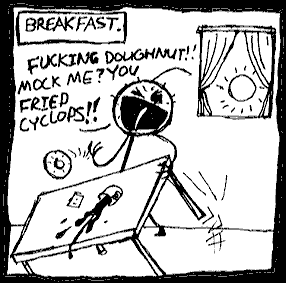
I should also point out that the book IS funny, though not as laugh-out-loud funny as my brother led me to believe. Maybe I'm just getting old, but I did find some chuckles, especially at Vasquez's ever-present, self-deprecating wit, which often takes the form of little notes and sidebars to the reader ("Attention Morons: Plot Development!").

What's fascinating is that despite all the violence, JTHM is actually a rich social commentary, and, though perhaps this is stretching it a bit, it's also a love story. In that sense it shares more in common with Edward Scissorhands (who Nny resembles), than South Park. It's the kind of book that is worth another look, particularly if, like I did, you dismissed it without giving it a fair shot. There's a lot here to satisfy even the die-hard alternative comics fan, and while it may not be the greatest thing ever written, it's unique and unforgettable.

Grade: 4/5